
Retail Analytics Dashboards: Drive Smarter Strategies and Gain a Competitive Edge
Explore retail analytics dashboards to drive smarter strategies and gain a competitive edge. Discover how data-driven insights can optimize operations, enhance customer experiences, and maximize profitability in the retail sector

.png)
Key Takeaways
- Four distinct dashboard types are needed to cover the full scope of retail analytics: Sales performance dashboards track revenue by channel and segment, inventory dashboards forecast demand, customer analytics dashboards enable segmentation and RFM analysis, and marketing dashboards measure CAC and campaign ROI.
- Customer Lifetime Value is a critical metric that most retail dashboards underutilize: Calculated as average order value × average purchase frequency × average customer lifespan, CLTV helps retailers prioritize retention strategies and personalize marketing to high-value customers.
- Inventory management dashboards should leverage machine learning for demand forecasting: Predictive demand forecasting reduces stockouts and prevents excess inventory, while ABC analysis classifies items by value and volume to implement tailored inventory management strategies for each category.
- RFM analysis within customer dashboards reveals which shoppers drive the most value: Segmenting customers by Recency, Frequency, and Monetary Value identifies the most valuable customer segments and enables targeted marketing campaigns and promotions.
- Stock value indicators track depreciation and inform repurchase timing decisions: A significant decrease in total inventory value signals outdated products, price drops, or damage, prompting retailers to adjust pricing, run promotions, or negotiate better supplier deals.
- Effective retail dashboards require SMART goals, not vague objectives like "more sales": Setting Specific, Measurable, Achievable, Relevant, and Time-bound goals—such as increasing conversion rates by 10% within the next quarter—provides direction and a way to gauge progress through dashboard metrics.
Traditionally, retail businesses manually identify top-selling items and track inventory levels, whether online or in-store.
But this process doesn't let the retail business focus on what matters:
- Providing better customer service
- Building stronger relationships with customers
- Driving sales
As a retail owner, you can achieve this by turning your data into actionable information with a visualization tool. A data visualization tool lets you identify customer preferences, buying habits, and shopping patterns. This allows them to provide a more seamless and enjoyable shopping experience, leading to better customer service, stronger relationships, and increased sales and loyalty.
See it in action
Retail Management Dashboards
What is a retail dashboard?
A retail dashboard is a digital tool that shows your store's key metrics, like sales, inventory, and customers, all in one place. It helps you run your business smarter.
Types of retail analytics dashboards
A single retail dashboard is great, but what if you could see even more? Different dashboards can focus on specific areas to give you a complete picture of your store. Here are some options:
Sales performance dashboard:

- Beyond basic sales figures: Look at sales trends by product category, location, demographics, and customer segments. This unveils which products or groups drive sales and where you can invest more.
- Dig into sales by channel: Analyze online vs. in-store sales performance, identify high-performing channels, and optimize marketing efforts accordingly.
- Customer lifetime value (CLTV) analysis: Incorporate CLTV metrics to understand customer profitability over time. This helps target high-value customers and personalize marketing strategies.
Inventory management dashboard:
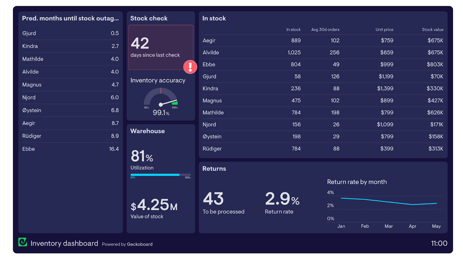
- Predict demand forecasting: Use machine learning to forecast demand and optimize inventory levels. This reduces stockouts, prevents excess inventory, and improves cash flow.
- Inventory turnover analysis: Track inventory turnover rates to identify fast- and slow-moving products. Adjust ordering patterns to optimize stock levels for each category.
- ABC analysis: Classify inventory items into A (high value/low volume), B (medium value/medium volume), and C (low value/high volume) categories. Implement tailored inventory management strategies for each category.
Customer analytics dashboard:

- Customer segmentation: You can segment customers based on purchase behavior, loyalty program engagement, and past interactions. This enables targeted marketing campaigns and promotions.
- RFM analysis: Analyze customer behavior using Recency, Frequency, Monetary Value (RFM) analysis. Identify your most valuable customers and tailor marketing efforts for different customer segments.
Marketing performance dashboard:

- Customer acquisition cost (CAC) analysis: Track CAC metrics to understand the cost of acquiring new customers. Optimize marketing campaigns to bring in customers profitably.
- Marketing ROI analysis: Measure the return on investment (ROI) of your marketing campaigns. Identify high-performing campaigns and optimize budget allocation for better results.
.gif)
Essential KPIs for a retail store dashboard
A retail dashboard contains valuable information, but some metrics deserve special attention.
Here are a few crucial key performance indicators (KPIs) and how they help you run your business better:
1. Sales growth (YoY or MoM):
This metric shows your sales increase over a specific period.
You can track month-over-month (MoM) or year-over-year (YoY) growth. Here are the formulas:
Year-over-Year (YoY) Sales Growth:
YoY sales growth = ([current year sales - previous year sales]/previous year sales) * 100
Month-over-Month (MoM) Sales Growth:
MoM sales growth = ([current month sales - previous month sales]/previous month sales) * 100
By subtracting the previous period's sales from the current period's sales, you get the absolute increase in sales. Dividing this difference by the previous period's sales gives you the relative growth rate in decimal form. Multiplying this decimal by 100 expresses the growth rate as a percentage.
Example:
Let's say a company's sales in May 2024 was $100,000 and in May 2023 it was $90,000.
- YoY sales growth for May 2024 = ([100,000 - 90,000]/90,000) * 100
- YoY sales growth = (10,000/90,000) * 100
- YoY sales growth = 0.111 * 100 = 11.11% (approximately)
This indicates that the company's sales in May 2024 was 11.11% higher compared to May 2023.
2. Customer lifetime value (CLTV):
It predicts the total revenue a customer will contribute to your business over the lifetime of their relationship with you.
Knowing your CLTV helps you prioritize customer retention strategies. There are various CLTV calculation methods, but a simple formula is as follows:
Average order value x average purchase frequency x average customer lifespan
Imagine an average customer spends $50 per purchase (average order value). On average, they make purchases every other month (average purchase frequency) for two years (average customer lifespan). There are 12 months a year, so every other month equals 12/2 = 6 yearly purchases.
CLTV = $50/purchase * 6 purchases/year * 2 years = $600
3. Return on investment (ROI):
This metric shows how much profit you earn for every dollar invested in something, like a marketing campaign.
A positive ROI indicates a successful investment. Here's the formula:
ROI = (gain from investment - cost of investment) / cost of investment x 100
Let's say you spend $10,000 on a social media campaign that generates $20,000 in sales. Your ROI would be (($20,000 - $10,000) / $10,000) x 100 = 100%.
Read More: Top Retail Metrics & KPIs to Track in 2024
Six actionable steps to building your retail KPI dashboard
1. Define measurable goals:
Don't just aim for "more sales" or "happier customers."
Be specific. Are you looking to increase conversion rates by 10% within the next quarter or reduce customer churn by 5%?
Turn the specific goal into a Specific, Measurable, Achievable, Relevant, and Time-bound (SMART) goal to provide direction and gauge progress through your dashboard.
2. Identify your stakeholders and data needs:
Every dashboard serves a distinct purpose.
Sales executives need deep dives into product performance and conversion rates by channel. Marketing teams crave customer segmentation insights and campaign effectiveness metrics. Identify the key stakeholders and tailor the KPIs to their specific roles and decision-making needs.
3. Choose KPIs that drive action:
Don't clutter your dashboard with vanity metrics that impress but lack actionable value.
Focus on KPIs that directly influence your business goals. Here are some examples:
- Sales growth: Conversion rate, average order value, sales by product category or brand
- Customer loyalty: Customer lifetime value (CLTV), customer satisfaction score (CSAT), churn rate
- Inventory management: Inventory turnover ratio, stockout rate, carrying costs
- Marketing performance: Customer acquisition cost (CAC), return on investment (ROI) for campaigns, click-through rate (CTR) by channel
4. Prioritize user experience with clear visualizations:
Leverage data visualization tools to create charts and graphs that present information clearly and concisely.
Utilize color-coding and interactive elements to enhance usability. Prioritize user experience to promote dashboard adoption and maximize its value.
5. Empower your team through training and feedback:
Train your team on leveraging the dashboard's full potential. Teach them to interpret the data, identify trends, and glean actionable insights.
Get feedback from users and iterate based on their suggestions. This ensures that the dashboard remains relevant and meets the evolving needs of your business.
6. Maintain relevance with regular updates and integration:
Schedule regular updates to ensure your data is accurate and reflects current trends, and explore advanced data analysis techniques to extract deeper insights from your KPIs.
Consider incorporating tools for customer segmentation, sentiment analysis (understanding customer feedback), and attribution modeling (evaluating marketing campaign effectiveness).
Retail dashboard templates with examples
To solidify your understanding of a retail dashboard, here are a few examples from our dashboard. See how each of them help you get close to a specific goal.
Product analytics:

This metric allows retailers to track two metrics simultaneously: the sum of the quantity sold and the sum of the total sale value.
This metric visually shows which products are most popular (by quantity sold) and which generate the most revenue (by total sale value). It can help you make informed decisions about things like:
- Inventory management: By seeing which products sell quickly, you can ensure you have enough stock on hand to meet demand. You can also identify slow-selling products that may need to be discounted or removed from inventory altogether.
- Product placement: You can use the chart to see which products are selling well together. You can use this information to strategically place products in the store, such as placing high-margin items near popular items to encourage impulse purchases.
- Marketing and promotions: The chart can help you identify the most profitable products, allowing you to focus marketing and promotional campaigns to increase sales and revenue.
Average unit price of products:

This pie chart can be a helpful tool in understanding product category pricing trends within your store. Here's how:
- Category performance analysis: By analyzing the size of the pie slices relative to each other, you can assess which product categories contribute most to overall sales based on average unit price. This can inform decisions about product selection and pricing strategies within each category.
- Pricing adjustments: If a category has a significantly lower average unit price compared to others, it might warrant investigating if the profit margins are adequate. This could indicate a need for price adjustments to improve profitability.
Stock value indicator:
This stock value indicator can help you manage your inventory by:
Tracking inventory performance: The indicator shows the inventory's current total value, allowing you to monitor its performance over time. Significant fluctuations could indicate issues like overstocking, shrinkage (theft or loss), or changes in product demand.
Monitoring depreciation: The percentage change from the last quarter helps track depreciation. A significant decrease suggests that the overall value of the inventory is declining, potentially due to outdated products, price drops, or damage. This can prompt you to take action like price adjustments, promotions, or write-offs.
Informing repurchase decisions: By monitoring stock value, retailers can see if the total value has dropped considerably. You can use the information to decide if repurchasing is necessary or if it's better to wait for prices to stabilize or negotiate better deals with suppliers to maintain profitability.
Unlock smoother customer journeys with DataBrain
As a retail business, you may not be tech-savvy to create visualizations from scratch.
However, a tool like DataBrain can remove the complexity and lets you create charts or graphs with a drag-and-drop feature. Moreover, you can use AI to make this process even faster, saving you countless time and effort, which you can use to run your business even better.
Get started with DataBrain for free. Sign up today.


