
Property Management Dashboard: KPIs, Examples, Templates & Best Practices (2026)

.png)
Key Takeaways
- Role-based dashboards outperform one-size-fits-all views because owners, regional leaders, onsite managers, and maintenance teams act on different metrics.
- Economic occupancy gives a more decision-useful signal than physical occupancy alone when concessions and delinquency are increasing.
- Dashboard adoption depends more on operating cadence (weekly and monthly reviews) than visualization quality.
- Embedded analytics inside PMS workflows reduces context switching and improves ongoing dashboard usage compared with standalone BI tools.
- In 2026, ESG and utilities visibility has moved from optional reporting to a practical requirement for many investor and compliance workflows.
Your rent collection numbers are in one system. Maintenance tickets live somewhere else. Lease expirations? Buried in a spreadsheet that someone on your team built in 2022 and nobody's touched the formulas since.
Monday morning rolls around. Your ops team spends the first couple hours pulling numbers from three different platforms, copying them into a shared Google Sheet, color-coding rows, and trying to piece together whether the portfolio is healthy or quietly falling apart.
A property management dashboard exists to end that cycle. One screen. Live data. Actual answers instead of two hours of tab-switching. But here's what happens in practice: the dashboard gets built, the data is half-stale by week three, the metrics don't map to anything anyone actually decides on, and the team drifts back to their spreadsheets.
This article walks through how to build one that sticks. Right KPIs. Right roles. Right data pipes. The kind of dashboard your team opens first thing in the morning because it genuinely tells them something they need to know.
What Is a Property Management Dashboard?
At its core, it's a single screen showing whether your properties are making money, costing you money, or somewhere in the gray zone between.
Think of it as a real estate dashboard purpose-built for operations. Not market comps. Not deal flow tracking. The actual day-to-day numbers: occupancy trends, delinquency aging, work order backlogs, NOI (Net Operating Income) by property. All of it pulled from your financial systems, leasing pipeline, maintenance logs, and tenant records into one view. No more four logins and three spreadsheets to answer a question that should take ten seconds. If you want more UI and layout inspiration, see these property management dashboards.
The line between a useful dashboard and a forgettable one is simpler than people realize. A forgettable dashboard displays data. A useful one answers questions. "Why did collections drop this month?" "Which property is carrying the most vacancy loss?" "Are we turning units fast enough to hit Q3?"
Multifamily operators, commercial property management firms, HOA (Homeowners Association) management companies, rental property investors, different contexts, same underlying need. See the full picture without digging through five tools to assemble it.
Who Actually Uses These Things?
Not everyone on the team needs the same view. Most teams miss this. They build one dashboard, ship it to everyone, and wonder why nobody's logging in.
Owners and investors only care about a handful of numbers. NOI, portfolio value, cash-on-cash returns. Give them a property management executive dashboard: five tiles, a trend line, done. They should never have to scroll past a plumbing work order.
Regional directors compare properties against each other. They're hunting for the outlier whose site has occupancy lagging, where maintenance costs are creeping. Outlier detection, not raw data.
Onsite property managers need a daily ops view. What work orders came in overnight? Which leases expire this week? Who's 30 days delinquent? The dashboard should answer "what am I dealing with today?" in under a minute.
Maintenance leads want backlog counts, resolution times, vendor performance, and whether they're actually hitting preventive maintenance targets instead of just chasing emergencies.
Accounting teams have their own world. Rent roll reconciliation, GL (General Ledger) accuracy, trust accounting visibility.
Five audiences. Five different dashboards. Roll them into one screen and you've built something that works for nobody. Role-based views aren't a premium feature. They're foundational. The best property management analytics platforms treat every role as a separate user with separate priorities. Real estate property management dashboard design starts here one audience per view.
Property Management Dashboard vs. Facility Management Dashboard
These get conflated constantly. A facility management dashboard centers on building systems. HVAC (Heating, Ventilation, and Air Conditioning) efficiency, energy usage, space utilization, compliance tracking. A property management dashboard focuses on the business side. Leasing, rent collection, NOI, tenant retention.
Maintenance tracking overlaps, sure. But the strategic question underneath is completely different. Facility management: "Is the building running efficiently?" Property management: "Is this asset generating the returns it should be?" Two different lenses. For the operational KPIs that sit between both, take a look at facility management KPIs.
Why Most Property Management Dashboards Fail
Worth understanding before you build anything. Most dashboards end up ignored within 60 days, and the reasons repeat.
Data silos. PMS (Property Management System) holds the leases. The GL system holds financials. CMMS (Computerized Maintenance Management System) holds the work orders. If the dashboard can't pull from all three reliably, people go back to their spreadsheets. The spreadsheet is clunky, but at least the numbers match what they expect.
Vanity metrics taking up space. "Total units managed" isn't a KPI. It's background information. If a number doesn't trigger a decision or an investigation, it shouldn't be on the screen.
No agreed-upon definitions across the team. One person calculates occupancy by including model units. Another person excludes them. Now every dashboard review turns into a debate about methodology instead of a conversation about performance. Standardize the formulas before building.
Latency gaps. Financial data closes monthly. Maintenance data updates every hour. Leasing data moves weekly. Refresh everything on the same schedule and half the numbers always feel stale for someone.
No meeting attached. A dashboard with no weekly standup, no monthly owner review, no quarterly investor call attached to it? It fades. Reporting habits are what drive adoption. Not the charts. For sustainable property management reporting cadences, see facility management reporting.
Data Sources: What Feeds a Property Management Dashboard?
A dashboard is only as trustworthy as what flows into it. Most portfolios pull from five to seven systems, and almost none of them were designed to share data with each other.
Property Management System (PMS) is the backbone. Lease records, tenant profiles, rent rolls, move-in/move-out tracking. Occupancy numbers, lease expirations, and rental income originate here.
General Ledger / Trust Accounting comes next. Accounting module your PMS bundles. This is where NOI, operating expenses, budget vs. actuals, and owner distributions come from. Trust accounting gets especially important if you're managing client funds. Investors expect their money tracked separately, with full audit trails.
CMMS: Maintenance module inside your PMS. Work order volume, MTTR (Mean Time to Repair), vendor SLA compliance, preventive maintenance schedules. The operational pulse.
CRM / Leasing Platform feeds lead-to-lease conversion rates, days on market, marketing spend by channel. Sometimes part of the PMS, sometimes a standalone tool like Knock or Funnel.
Payment Portals & IoT round it out. Online rent payment data, smart lock access logs, utility submetering, water and energy consumption. IoT feeds matter more each year, especially for ESG tracking and anomaly detection. A water usage spike at 3 AM in a unit that's supposed to be vacant? That's a leak. Your dashboard catches it before the water bill does.
Integrations & APIs: Bringing It All Together
The real challenge isn't deciding what data matters. It's getting data from those systems into a single place. Three options: direct API connections for near real-time feeds, ETL pipelines that batch data into a warehouse on a nightly schedule, or flat-file exports (CSV/Excel) for teams without engineering resources. Portfolio size and technical capacity determine which approach makes sense. PM software vendors looking to ship embedded analytics inside their product need pre-built connectors and a flexible data integration layer. There's no shortcut around this.
Essential Property Management Dashboard Metrics
Listing KPI names is the easy part. What matters is the formula behind each one, who owns it, how often it refreshes, and the benchmark that separates "we're fine" from "we have a problem." Here's the actual breakdown for property manager KPIs.
Financial KPIs
Start with Net Operating Income (NOI). Formula: Gross Rental Income - Operating Expenses = NOI excluding debt service and CapEx. This is the number that anchors every property management financial dashboard. Track it monthly. Compare year-over-year. If NOI is declining and you can't explain why within 30 seconds, the rest of the dashboard is a distraction.
Rent Collection Rate: Rent Collected / Rent Billed × 100. When this drops below 95%, you've got a collections process problem somewhere. Don't just look at the portfolio-level number. Break it down by property and delinquency aging bucket: 30, 60, 90 days to find where the money's getting stuck.
Operating Expense Ratio (OER): Operating Expenses / Gross Operating Income × 100. For multifamily, a healthy range sits between 35% and 45%. Older assets tend to run higher. If this ratio climbs quarter after quarter, look at maintenance contracts and vendor pricing. Something's driving it up.
Then there's Loss to Lease: (Market Rent - In-Place Rent) / Market Rent × 100. This number shows revenue left on the table. If loss to lease climbs above 3-5%, your renewal pricing strategy needs a closer look.
Leasing & Occupancy KPIs
Occupancy Rate vs. Economic Occupancy and the distinction matters. Physical occupancy just counts filled units. Economic occupancy factors in concessions, delinquency, and vacancy loss. You can have 96% physical occupancy and still be bleeding money if concessions and delinquency are eating into effective revenue. Track weekly.
Lease Expiration Pipeline: a rolling 90-day view of leases coming due. Without it, you're always reacting to vacancies after the fact instead of catching them early. Pair this with renewal probability data if your PMS supports it.
Days on Market measures how long vacant units sit before someone signs. Track it by unit type, property, and price point. If studios lease in 12 days but two-bedrooms sit vacant for 40, that's a segment-specific pricing or marketing problem.
Lead-to-Lease Conversion tells you where your leasing funnel is leaking. High lead volume but low conversion usually points to a pricing mismatch or a sales execution gap not a marketing problem.
Maintenance & Operations KPIs
Work Order Backlog: how many open requests exist right now. If the number keeps growing, you're looking at understaffing, vendor delays, or process gaps. Check it daily.
Mean Time to Resolve (MTTR): how long from when a request comes in to when it's marked complete. Split this between emergency and routine. When routine MTTR creeps above 5 business days, tenant satisfaction starts showing it.
Preventive vs. Reactive Maintenance Ratio reveals how your team spends its time. Best-performing teams run 70-80% preventive. Heavy on reactive? You're spending more, responding slower, and wearing out your team.
First-Time-Fix Rate (FTFR): the percentage of maintenance issues resolved in one visit. Formula: Issues Fixed on First Visit / Total Work Orders × 100. This metric helps surface repeat visits that create resident frustration and hidden labor cost.
Callback (Repeat Work Order) Rate: the share of requests reopened for the same issue within a defined window (often 30 days). Formula: Repeat Requests / Total Work Orders × 100. A rising callback rate usually points to root-cause and quality-control issues with vendors or work-order detail.
Turnover / Make-Ready Days: the window between move-out and move-in ready. Every additional day is direct vacancy loss. Efficient teams get standard turns done in 5-7 days.
Benchmark note: published industry targets vary by asset mix and operating model. For direction, many public guides cite occupancy targets around 95-96% in stronger urban markets and rent collection goals near 98% for well-run portfolios; formulas are outlined in Buildium and Revela resources. Validate targets against your own portfolio baseline before operationalizing them.
Sources: Buildium KPI guide, Revela KPI guide, Oxmaint maintenance KPI reference
Tenant Experience KPIs
Renewal Rate is a leading indicator for almost everything else. When it drops below 50-55%, something's off and the cheapest way to find out what is surveying tenants who chose to leave. Renewals cost a fraction of new leases. Protecting this number should be a priority.
Tenant Portal Adoption deserves its own spot on the dashboard. Formula: Active Portal Users / Total Active Tenants × 100. If adoption on your online payment and maintenance request portal is low, the experience likely needs attention. And your leasing and maintenance teams are still fielding phone calls and processing paper checks as a result. A tenant portal analytics dashboard tracks this so you can spot the drop-off and fix it.
Automation Adoption Rate is a practical 2026 KPI for PM operators using workflow automation in leasing, collections, and service requests. Formula: Automated Workflow Completions / Total Eligible Workflow Completions × 100. This helps teams measure whether automation investments are being used in day-to-day execution.
Property Management Company KPIs (Operator-Level)
If you manage doors at scale for owners, property-level metrics are not enough. You also need a management-company lens:
- Revenue Per Door: Total PM Company Revenue / Total Doors Managed
- Owner Retention Rate: Owners Retained in Period / Total Owners at Start of Period × 100
- Doors Added vs. Doors Lost (Net Door Growth): New Doors Added - Doors Lost
- Time-to-Close Monthly Books: days from month-end to finalized reporting package
Property Management Dashboard Examples by Use Case
Theory only goes so far. Here's what each dashboard type should contain, who looks at it, and what it's designed to answer.
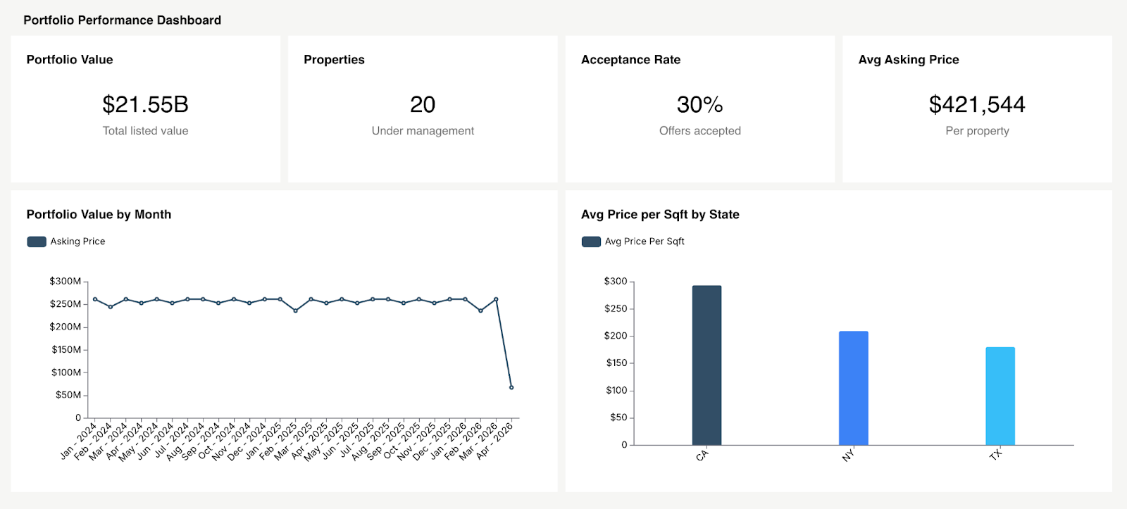
1. Portfolio Performance Dashboard
Built for owners, investors, and asset managers. Portfolio value, aggregate NOI, weighted average occupancy, cash flow. Twelve-month trend lines. A property comparison table sorted by NOI per unit so the underperformers surface immediately. This is the rental property dashboard investors open every week.
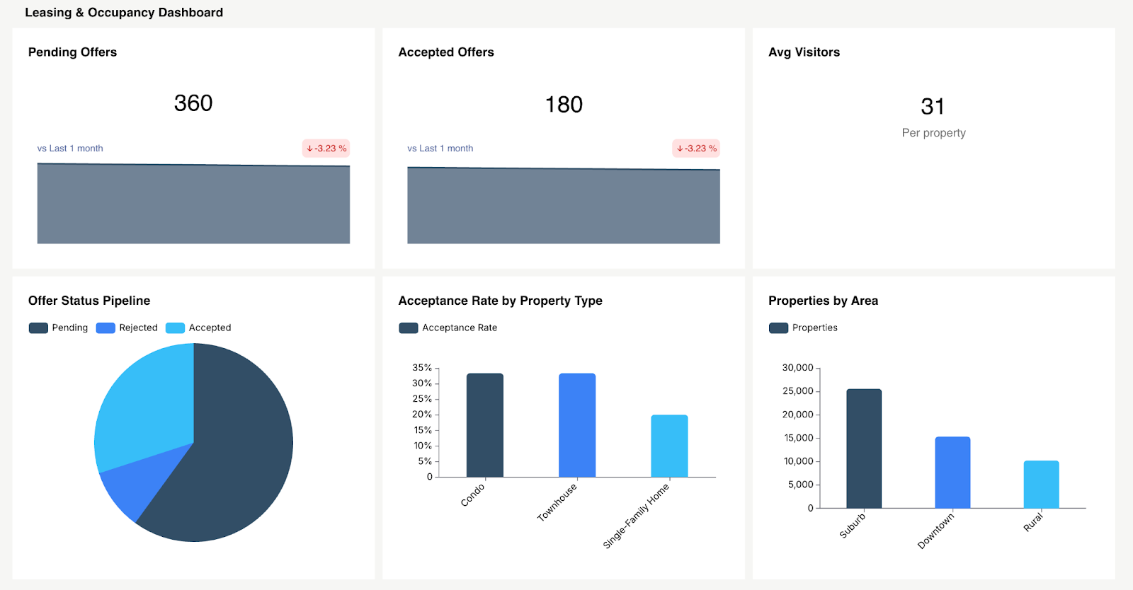
2. Leasing & Occupancy Dashboard
Built for leasing directors and regional managers. Occupancy by property and unit type. Lease expiration calendar. Lead-to-lease conversion funnel. Days on market by category. It should answer one question clearly: "Will we hit our occupancy target this quarter, and if not, where exactly is the shortfall?"
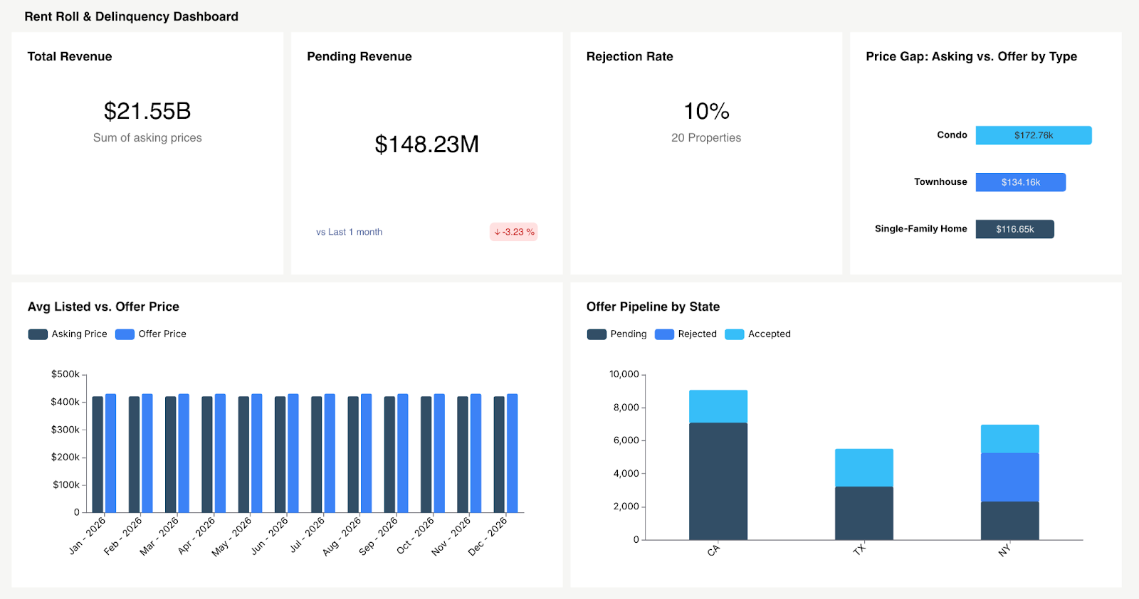
3. Rent Roll & Delinquency Dashboard
Built for accounting teams and property managers. Rent billed vs. collected, delinquency aging buckets (current/30/60/90+), loss to lease by property, concession tracking. The diagnostic value is what matters most here. If collections are slipping but occupancy is steady, the issue is delinquency, not vacancy. Segment by asset class to pinpoint it.
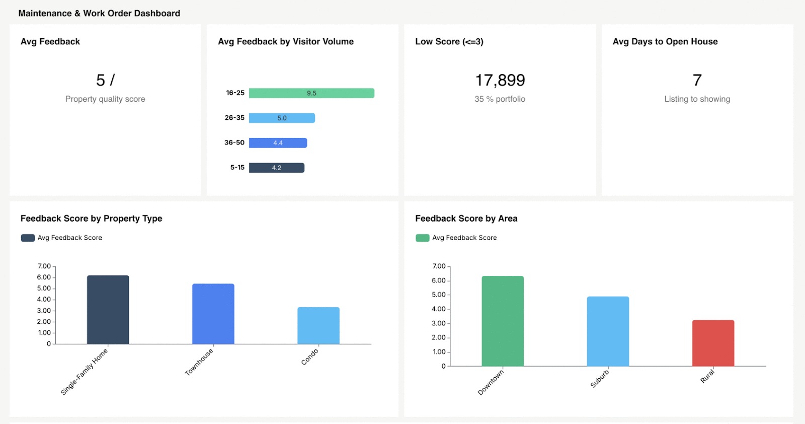
4. Maintenance & Work Order Dashboard
Built for maintenance leads and onsite managers. Open work order count, MTTR, completion rate, cost per work order, preventive maintenance compliance. Break it out by property and category: plumbing, HVAC, appliances to identify recurring issues that warrant capital investment instead of repeated short-term fixes.
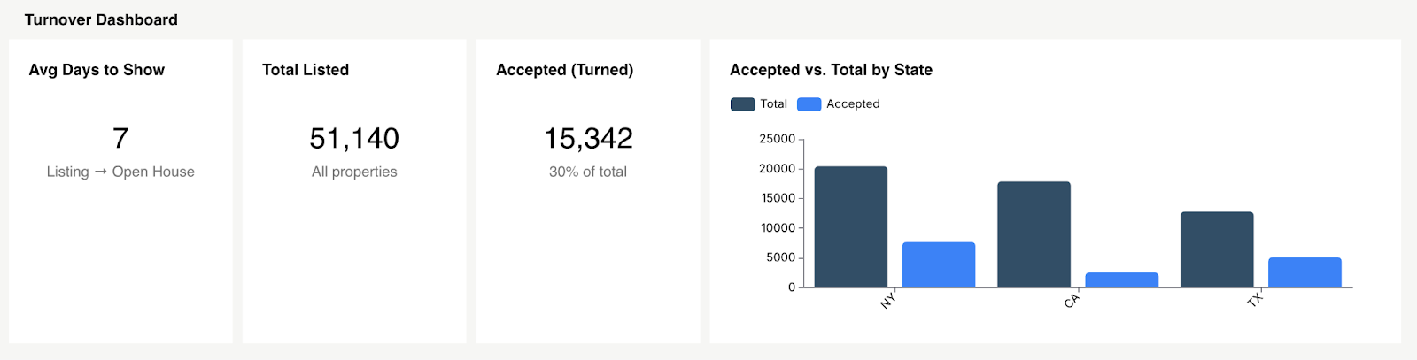
5. Turnover / Make-Ready Dashboard
Built for operations managers. Average make-ready days, cost per turn, units in progress, and where bottlenecks sit (waiting on a vendor, waiting on inspection, waiting on parts). Every day trimmed from the turn cycle lands directly on the top line.
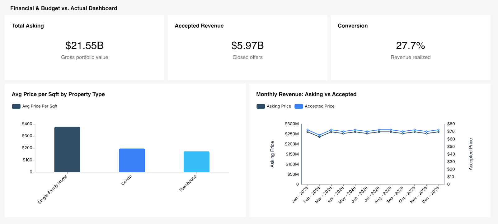
6. Financial & Budget vs. Actual Dashboard
Built for CFOs, asset managers, and investors. Budget vs. actual for revenue and expenses, broken out by property and line item. Variance highlights. CapEx vs. OpEx tracking. This dashboard answers whether the business plan is actually performing or whether you're drifting off target without realizing it.
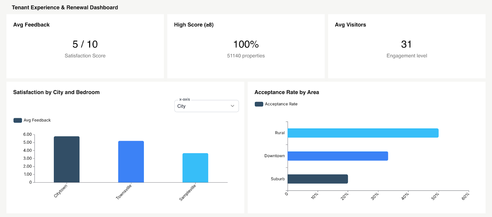
7. Tenant Experience & Renewal Dashboard
Built for regional managers and leasing leads. Renewal rate by property, satisfaction scores where available, portal adoption rates, and maintenance satisfaction correlated with renewal likelihood. The connection between operational execution and retention outcomes is direct. If maintenance response time lags, renewal rates follow.
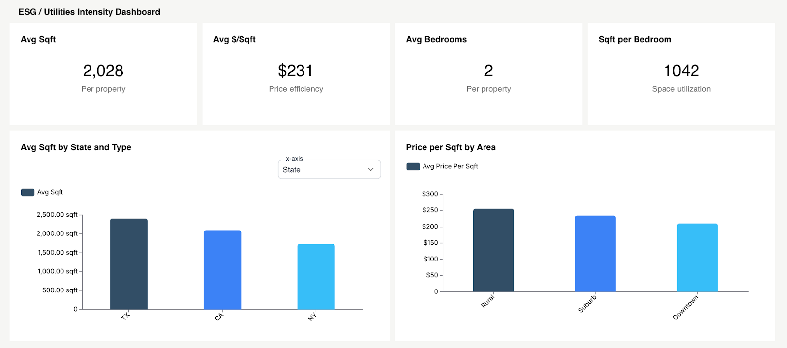
8. ESG / Utilities Intensity Dashboard
Built for sustainability officers, asset managers, and institutional investors. Energy consumption per square foot, water usage trends, waste diversion rates, carbon intensity by building, and status of LEED/BREEAM-aligned goals where applicable. In 2026, institutional investors and compliance frameworks demand ESG visibility. This isn't a forward-thinking add-on, it's becoming a prerequisite for certain types of capital.
Property Management Dashboard Templates: What to Include
When putting together a property management dashboard template, a few layout decisions separate the dashboards people use from the ones they forget about.
Put your highest-priority KPIs above the fold. Four to six headline numbers at the top of the screen: NOI, occupancy, collections rate, work order backlog each with a red/yellow/green status indicator. Nobody should have to scroll to find out if something needs attention.
Depth on demand, not everything at once. Resist the urge to show every metric on one screen. Surface the summary. Let users click into a property, drill into a specific metric, or narrow by time period. That's what good SaaS dashboard design looks like in practice: progressive disclosure.
Design for mobile. Onsite property managers and maintenance leads spend their days walking properties, not sitting at desks. If the dashboard doesn't render well on a phone vertical scroll, large tap targets, simplified layout half your intended users won't bother.
Offer a downloadable KPI checklist. Whether for your own internal team or for your customers (if you're a PM software vendor building this into your product), a simple spreadsheet mapping metrics to data sources is a practical starting point and a strong lead magnet.
How to Build a Property Management Dashboard (Step-by-Step)
Step 1: Define Decisions First
Don't begin with "what data do we have." Begin with "what decisions does our team make every week, and what would help them make those decisions faster?" Work backward from the decision to the metric to the data source.
Step 2: Map Metrics to Data Sources
For each KPI: where does the data live (PMS, GL, CMMS, CRM)? How frequently does it update? Who's accountable for accuracy? This step exposes integration gaps long before they become launch-day problems.
Step 3: Standardize Definitions Across Properties
"Occupancy" means something different to three different teams on the same org chart. Before you build anything, get the formulas agreed upon company-wide. Write them down. Share them. Hold people to them.
Step 4: Choose Embedded vs. Standalone BI
Standalone tools like Tableau or Power BI offer deep flexibility, but they require people to step outside their daily workflow to use them. That friction drags adoption down over time. Embedded analytics places the dashboards directly inside the property management software dashboard your team already works in. Bigger difference than it sounds. More on this in the next section.
Step 5: Roll Out by Role & Train Teams
Ship role-specific views, not one master dashboard. Then train people on when to use it, not just how. Tie dashboard reviews to existing weekly standups and monthly owner calls. Without that rhythm, dashboards fade from habit.
Step 6: Govern Access (Owners, Staff, Investors)
Investors see portfolio-level data. Onsite managers see their property. Maintenance leads see work order queues. Row-level security and multi-tenant analytics make this possible without building and maintaining separate dashboards for every user group.
Property Management Software & Dashboards: Build vs. Buy vs. Embed
Most PM teams don't spend enough time on this decision, and it shapes everything downstream.
Native PMS reports are the path of least resistance. They're built in. But they're also limited to canned report formats, minimal customization, and rarely a cross-system view that brings maintenance, financials, and leasing together in one place.
Standalone BI platforms (Tableau, Power BI, Looker) offer full analytical power but require a data team, a warehouse, and ongoing upkeep. Users have to leave the tool they work in every day to open a separate application. Adoption drops fast. This works for enterprise teams with dedicated data analysts. Mid-market PM companies rarely have that luxury.
As a practical sizing heuristic: smaller teams often start with spreadsheet-driven dashboards, teams in growth mode standardize in PM software reporting, and larger operators move to BI or embedded models once cross-system analysis and stakeholder segmentation become non-negotiable.
Embedded analytics is the third option, and it's where momentum has shifted. Platforms like Databrain allow PM software vendors to embed interactive, white-label embedded analytics property management dashboards directly inside their existing product.
Why PM Platforms Are Embedding Dashboards Inside the Product
Property managers work inside the PMS all day. Expecting them to export data, open a separate BI tool, and build their own analysis is expecting something that won't happen consistently.
Meanwhile, portfolio companies and institutional investors now expect analytics to live inside the portal they already use. Not a monthly PDF in their inbox. Not a login to a separate tool. Inside the product.
Embedded analytics makes this practical: faster time-to-ship, white-label branding that matches the host product, JWT/SSO authentication patterns, and multi-tenant data isolation out of the box.
If you're a PM SaaS vendor weighing embedded analytics for property management software, the question isn't whether to offer dashboards. It's whether building from scratch makes sense compared to embedding a platform built for this. For most teams, embedding wins on speed, cost, and long-term maintenance burden. See embedded analytics software and customer-facing analytics in practice.
Property Management Dashboard Best Practices for 2026
Set threshold alerts. Collections dropped below 95%? Work order backlog crossed 50 open tickets? The system should notify the right person. Don't rely on someone noticing it during a weekly review.
Lean into anomaly detection. AI-assisted triage picks up patterns humans miss a maintenance cost spike at one property, a water bill that tripled between billing cycles. Early flag, early fix. See how AI-powered dashboards are making this standard.
Enable self-service reporting. Regional managers and property owners will always want their own custom views. Give them filtered dashboards and export options so your team isn't fielding ad hoc data requests every week.
Put compliance and insurance claims on the dashboard. Commercial portfolios, especially tracking safety inspections, active insurance claims, and regulatory compliance deadlines on the same screen as financial KPIs, prevent costly surprises at audit time.
Match refresh cadence to decision speed. Financial data refreshes monthly after close. Leasing and occupancy numbers should update daily. Maintenance data needs real-time or near real-time feeds. One refresh schedule for everything guarantees that some data always feels outdated.
Conclusion
Every day, your properties generate data. Rent payments. Work orders. Lease renewals. Utility readings. Tenant requests. Right now, most of that data sits in separate systems that don't talk to each other. Your team spends hours each week pulling it together manually just to get an approximate picture of what's going on.
That's not property management. That's data assembly.
The right dashboard, right metrics, right roles, right refresh cadence is the difference between catching a problem while it's still cheap to fix and finding out about it after it's already hit your bottom line.
The playbook is right here.
Ready to embed analytics directly into your property management platform?
Start with Databrain and give your team and your customers the dashboard software they'll actually open every morning.
Frequently Asked Questions
What is a property management dashboard?
A centralized visual tool that pulls financial, leasing, maintenance, and tenant data from across your portfolio into one interface. It replaces manual spreadsheet assembly with live, decision-ready views that update automatically.
How do you integrate maintenance data into a property dashboard?
Most CMMS platforms support API connections or scheduled data exports. Connect through a direct API for real-time updates, or set up an ETL pipeline for nightly batch syncs into your data warehouse. The end goal is a single view where maintenance KPIs sit next to financial and leasing data without switching tools.
What's the difference between property management and facility management dashboards?
Property management dashboards track leasing, revenue, tenant relationships, and asset-level returns. Facility management dashboards focus on building systems, energy performance, space utilization, and compliance requirements. Related, but the strategic lens is different. For more on where the analytics overlap, see facility management analytics.
What KPIs should be on a property management dashboard?
At minimum: NOI, occupancy rate, rent collection rate, delinquency aging, work order backlog, MTTR, lease expiration pipeline, and renewal rate. After that, customize based on your role and the types of properties in your portfolio.
How is NOI tracked on a property management dashboard?
Gross rental income minus operating expenses. Revenue data typically comes from the PMS or GL system. Operating expense line items are subtracted automatically. Most teams refresh this monthly after financials close.


