Essential Python Libraries for Effective Data Visualization in 2024

Python is a powerful programming language used for data analysis. It also boasts a rich ecosystem of libraries specifically designed for data visualization. These libraries provide tools to create various charts and graphs, enabling you to present your data in an informative and engaging way.

Integrate your CRM with other tools

Lorem ipsum dolor sit amet, consectetur adipiscing elit lobortis arcu enim urna adipiscing praesent velit viverra sit semper lorem eu cursus vel hendrerit elementum morbi curabitur etiam nibh justo, lorem aliquet donec sed sit mi dignissim at ante massa mattis.

  1. Neque sodales ut etiam sit amet nisl purus non tellus orci ac auctor
  2. Adipiscing elit ut aliquam purus sit amet viverra suspendisse potenti
  3. Mauris commodo quis imperdiet massa tincidunt nunc pulvinar
  4. Adipiscing elit ut aliquam purus sit amet viverra suspendisse potenti

How to connect your integrations to your CRM platform?

Vitae congue eu consequat ac felis placerat vestibulum lectus mauris ultrices cursus sit amet dictum sit amet justo donec enim diam porttitor lacus luctus accumsan tortor posuere praesent tristique magna sit amet purus gravida quis blandit turpis.

Commodo quis imperdiet massa tincidunt nunc pulvinar

Techbit is the next-gen CRM platform designed for modern sales teams

At risus viverra adipiscing at in tellus integer feugiat nisl pretium fusce id velit ut tortor sagittis orci a scelerisque purus semper eget at lectus urna duis convallis. porta nibh venenatis cras sed felis eget neque laoreet suspendisse interdum consectetur libero id faucibus nisl donec pretium vulputate sapien nec sagittis aliquam nunc lobortis mattis aliquam faucibus purus in.

  • Neque sodales ut etiam sit amet nisl purus non tellus orci ac auctor
  • Adipiscing elit ut aliquam purus sit amet viverra suspendisse potenti venenatis
  • Mauris commodo quis imperdiet massa at in tincidunt nunc pulvinar
  • Adipiscing elit ut aliquam purus sit amet viverra suspendisse potenti consectetur
Why using the right CRM can make your team close more sales?

Nisi quis eleifend quam adipiscing vitae aliquet bibendum enim facilisis gravida neque. Velit euismod in pellentesque massa placerat volutpat lacus laoreet non curabitur gravida odio aenean sed adipiscing diam donec adipiscing tristique risus. amet est placerat.

“Nisi quis eleifend quam adipiscing vitae aliquet bibendum enim facilisis gravida neque velit euismod in pellentesque massa placerat.”
What other features would you like to see in our product?

Eget lorem dolor sed viverra ipsum nunc aliquet bibendum felis donec et odio pellentesque diam volutpat commodo sed egestas aliquam sem fringilla ut morbi tincidunt augue interdum velit euismod eu tincidunt tortor aliquam nulla facilisi aenean sed adipiscing diam donec adipiscing ut lectus arcu bibendum at varius vel pharetra nibh venenatis cras sed felis eget.

Heading 1

Heading 2

Heading 3

Heading 4

Heading 5
Heading 6

Lorem ipsum dolor sit amet, consectetur adipiscing elit, sed do eiusmod tempor incididunt ut labore et dolore magna aliqua. Ut enim ad minim veniam, quis nostrud exercitation ullamco laboris nisi ut aliquip ex ea commodo consequat. Duis aute irure dolor in reprehenderit in voluptate velit esse cillum dolore eu fugiat nulla pariatur.

Block quote

Ordered list

  1. Item 1
  2. Item 2
  3. Item 3

Unordered list

  • Item A
  • Item B
  • Item C

Text link

Bold text

Emphasis

Superscript

Subscript

Data visualization transforms complex data sets into visual representations, like charts and graphs. It allows you to understand patterns, trends, and relationships within the data more easily.

Python is a powerful programming language used for data analysis. It also boasts a rich ecosystem of libraries specifically designed for data visualization. These libraries provide tools to create various charts and graphs, enabling you to present your data in an informative and engaging way.

Best Python libraries for data visualization in 2024

1. Matplotlib

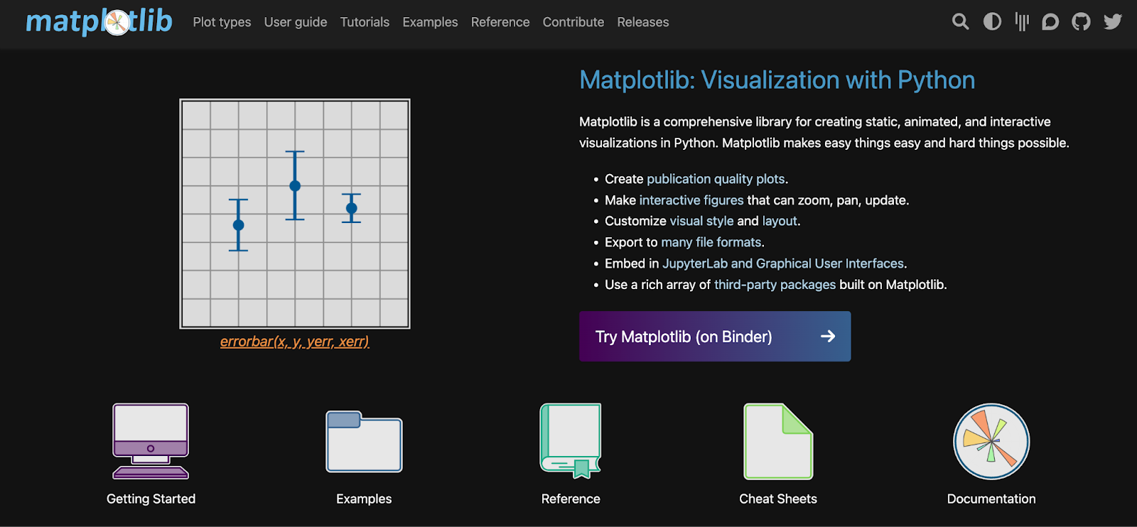
Matplotlib is the most established data visualization library in Python. It offers a wide range of plot types, from basic line charts to complex 3D visualizations.
Matplotlib - Phython Libraries for data visualization

Pros & Cons

  • Publication-worthy quality:  Matplotlib produces high-resolution plots that meet the standards of scientific publications. You can generate crisp and clear visuals that effectively communicate insights from your data.
  • Interactive exploration: Matplotlib goes beyond static images. It facilitates the creation of interactive figures that users can zoom, pan, and update in real time. 
  • Cross-platform compatibility:  Matplotlib's output can be exported to various file formats, ensuring compatibility with different operating systems and software. Share your visualizations seamlessly across platforms.
  • Integration with existing tools:  Matplotlib integrates smoothly with JupyterLab, a popular interactive environment for scientific computing. It allows you to create and analyze visualizations within your workflow. You can also embed Matplotlib plots into graphical user interfaces (GUIs) for interactive applications.
  • Learning curve for complex visualizations: While beginner-friendly for basic plots, creating highly customized or advanced visualizations can involve a steeper learning curve.
  • Performance for large datasets: Matplotlib might not be the most efficient choice for handling extensive datasets. For massive data, other libraries optimized for performance might be better suited.
  • Default aesthetics: Achieving a polished, modern look requires effort compared to other libraries.

2. Seaborn

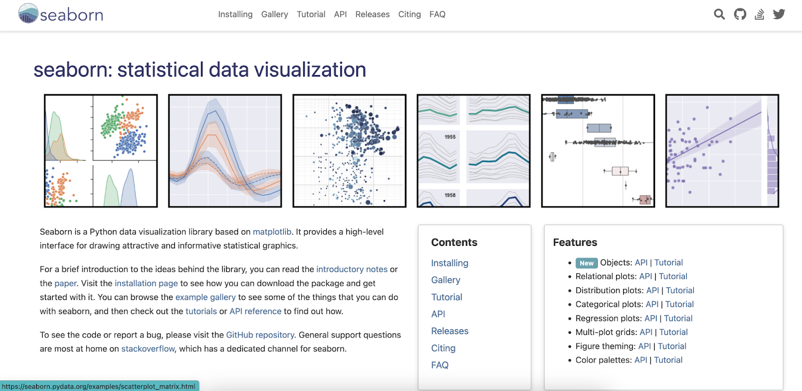
Seaborn is a high-level library built on top of Matplotlib. It is for creating informative and visually appealing statistical graphics. It simplifies data visualization by working seamlessly with Pandas data frames and takes care of behind-the-scenes plotting mechanics.
Seaborn - Phython Libraries for data visualization

Pros & Cons

  • High-level API for statistical graphics: It eliminates the need to write long lines of code typically required with Matplotlib. Seaborn handles the technical aspects like adding labels, legends, and formatting, allowing you to focus on the meaning of your data and the message you want to convey. This saves you time and lets you explore your data more efficiently.
  • Effortless switching between visualizations: Seaborn makes it easy to create different plot types with minimal code changes. You can quickly switch between scatter plots, line plots, or other visualization styles to find the one that best represents your data.
  • Plots tailored for categorical data: Seaborn offers a rich set of plot types specifically designed to effectively visualize categorical data, which contains labels or groups rather than numerical values.
  • Big datasets: It can slow down when dealing with massive datasets. It relies on Matplotlib, which isn't built to handle vast amounts of information super fast.

3. Bokeh

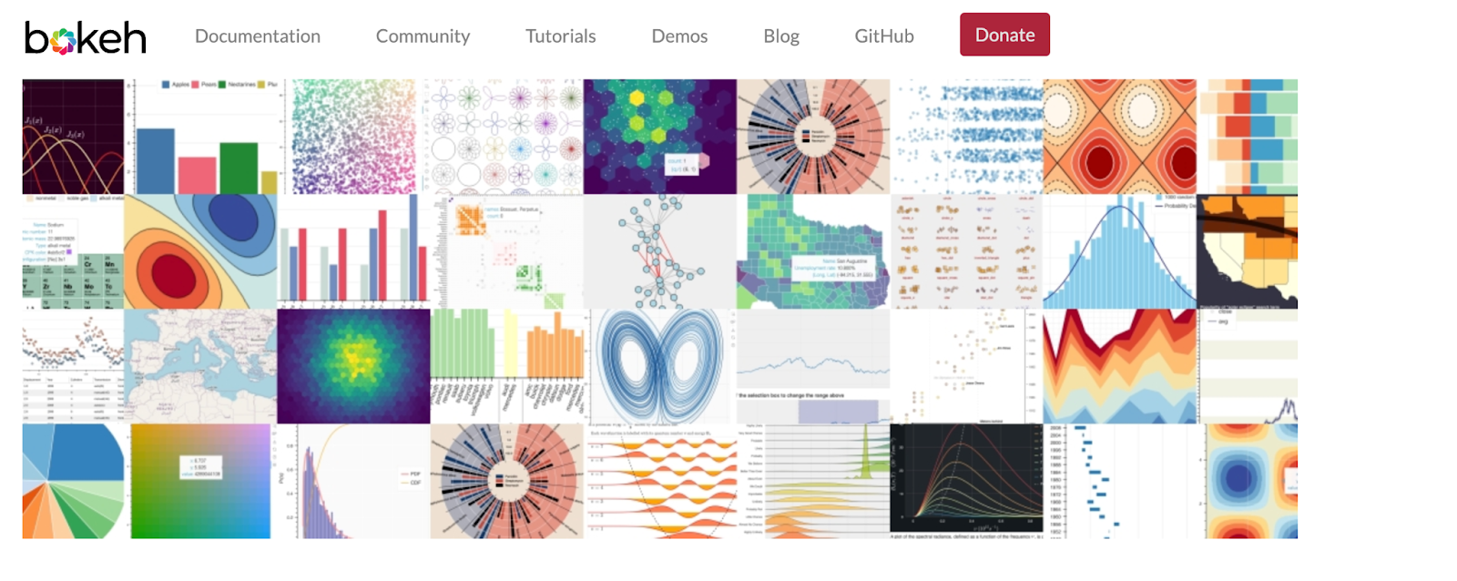
Bokeh excels at generating interactive visualizations that run in web browsers.
Bokeh - Phython Libraries for data visualization

Pros & Cons

  • Flexible: Bokeh can handle common plots and custom or specialized use cases.
  • Interactive: Tools and widgets let you and your audience interactively explore data.
  • Shareable: Plots, dashboards, and apps created with Bokeh can be published on web pages or Jupyter notebooks, making it easy to share your work with others.
  • Productive: Bokeh works seamlessly within the Python ecosystem, integrating well with other popular PyData tools.
  • Powerful: Bokeh allows you to add custom JavaScript to support advanced or specialized visualizations, giving you a high degree of control over the final output.
  • Open source: Bokeh is an open-source project, with everything, including the Bokeh server, being Berkeley Software Distribution (BSD) licensed and available on GitHub for public contribution and development.
  • Limited interactivity: While great for charts, Bokeh doesn't offer fancy interactions for dynamic data exploration. It focuses on creating static visualizations like line and bar charts.

4. Plotly

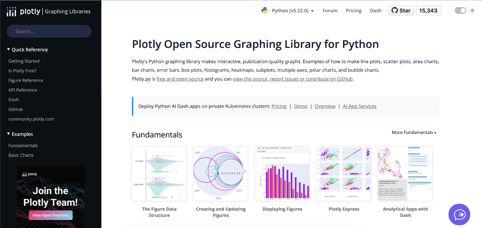
Plotly allows you to create visually impressive and interactive visualizations.
Bokeh - Phython Libraries for data visualization

Pros & Cons

  • Few lines, high-quality output: Plotly excels at creating visually appealing and interactive charts with concise code compared to other libraries.
  • Focuses on interactivity: Plotly prioritizes creating interactive visualizations, offering more user interaction features than Matplotlib or Seaborn.
  • Potential documentation challenges: Keeping up with the latest information in Plotly's documentation might take time due to various tools within the Plotly ecosystem.

Python data visualization libraries: Quick Comparson

Here's a table comparing the key features of the Python data visualization libraries:

Feature Matplotlib Seaborn Plotly Bokeh
Chart types supported Extensive (scatter, line, bar, histogram, etc.) Commonly used for data exploration (violin plots, box plots, etc.) Wide range, including interactive elements Extensive (scatter, line, bar, histogram, etc.)
Customization level Highly customizable (every aspect of the chart) Less customizable than Matplotlib but still offers reasonable control Limited customization for a more user-friendly experience Flexible customization with a focus on interactivity
Interactivity Limited (static charts) Limited (static charts) Highly interactive Highly interactive
Learning curve Steeper learning curve due to fine-grained control Easier to learn than Matplotlib Moderate learning curve Moderate learning curve
Use cases Publication-quality visualizations, complex charts Exploratory data analysis, statistical graphics Interactive dashboards, web applications, data storytelling Interactive dashboards, data exploration, web applications

Best practices for data visualization in Python

When creating visualizations, clear communication is crucial. Here are some fundamental principles for impactful Python visualizations:

  • Know your audience: Customize visualizations to suit your audience, whether technical experts or the general audience.
  • Choose wisely: Select the chart type that best represents your data. Line charts for trends and bar charts for comparisons are just a few examples.
  • Label everything:  Clearly label axes, data points, and legends. Context is essential for viewers to understand the information.
  • Color with care: Use color strategically to highlight essential information or differentiate categories. Avoid too many colors or confusing palettes that can overwhelm viewers.

Choosing a Python visualization library

Selecting the right one becomes crucial with a vast array of Python data visualization libraries. Here's a framework to guide your choice:

  • Project goals:  Are you creating static reports, interactive dashboards, or web-based visualizations? Be clear and specific about your goals. 
  • Target audience: Who will be viewing the visualizations? The technical expertise of the audience can influence chart complexity and library choice.
  • Interactivity level: Do you need basic click-through features or highly dynamic visualizations with user input capabilities?

Making the decision:

  • General-purpose versatility: Matplotlib is an excellent foundation for various customization options. Seaborn, built on top of Matplotlib, offers a simpler interface for creating statistical graphics.
  • Interactive explorations: If interactivity is key, Plotly excels at creating web-ready visualizations with zooming, panning, and data selection features.

Remember, there's no single "best" library. By considering your project goals and target audience, you can select the Python visualization library that empowers you to create impactful and informative visuals.

Explore sample dashboards on DataBrain to see the power of interactive visualizations.

Overcoming data visualization challenges

Data visualization has its challenges. Here are a few common ones and how to address them:

  • Data cleaning: Ensure your data is accurate before visualizing it. There are tools and techniques to clean and prepare your data.
  • Color choices: Consider color blindness when choosing color palettes. Many online resources offer colorblind-friendly palettes.
  • Chart clutter: Avoid overwhelming viewers with excessive elements. Focus on the core message and use white space effectively.

Start building interactive dashboards. 

DataBrain is an intuitive platform that empowers you to design interactive dashboards to showcase your data dynamically and engagingly. With DataBrain, you don't need to learn programming languages to create data visualizations. The simple drag-and-drop interface and user-friendly design make the visualization creation process seamless and straightforward.

Explore sample dashboards on DataBrain to see the power of interactive visualizations.

Conclusion:

Having explored data visualization libraries, remember to use your new skills to tell a story with your data — present facts and figures through charts and graphs to engage your audience. Make your data compelling with vibrant colors and clear charts.

While Python libraries offer various data visualizations, selecting the suitable library depends on your specific needs.

Book a free Databrain demo to learn how to create interactive dashboards that bring your data to life.

Build AI Powered Interactive Dashboard with Databrain
Thank you! Your submission has been received!
Oops! Something went wrong while submitting the form.

Build Customer Facing dashboards, 10X faster

Start Building

Make customer facing analytics your competitive advantage.